I've often read, and agreed with, the advice that side projects should be solving problems or answering questions that you yourself are interested in.
To that end, I've always wanted to know how well the Hungarian national team have done against various countries worldwide. Hungary has a glorious football past, although the last 30 years have been possibly the worst ever decades in Hungarian football.
To explore this question, I scraped a dataset of all matches played by the Hungarian national team since 1907, aggregated it and made an interactive world map.
I'll start with the final map, and you can read about some of the details beneath.
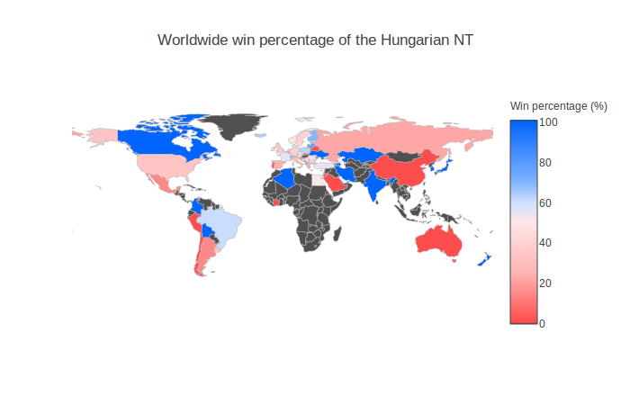
The worldwide win percentage of the national team
There is an interactive version where you can zoom and hover over each country to find out more. I encourage you to look at it if you want to dive into the data and explore.
The Details
The Data
I scraped the data from the wonderful http://www.magyarfutball.hu which is a great resource for those with the very niche interest in Hungarian football. The data was unsurprisingly in Hungarian so I also had to translate it!
There is a Jupyter notebook for the scraping code and the final dataset is also available.
The Map
My last experiment making a choropleth map was missing some features I'd have liked to add, such as more interactivity. The library I used, folium, is still under development so for this project I tried something new.
Introducing plot.ly!
It's a great visualisation toolkit with a Python wrapper. It is much easier to make interactive choropleths with it, I specifically used this set of tutorials. The ability to customise the hover label meant I could make a much more useful visualisation, which you can explore.
There is a Jupyter notebook where I aggregated the data, dealt with countries that don't exist anymore (the USSR, Yugoslavia, etc.) and made the final map.
This post originally appeared on my blog in 2017

About David
I'm a freelance data scientist consultant and educator with an MSc. in Data Science and a background in software and web development. My previous roles have been a range of data science, software development, team management and software architecting jobs.
