The "Best FIFA Football Awards" took place recently and while the final outcome was not surprising, I've always wanted to know which countries vote for which players.
The way the voting works is that the captain and coach of every national team in FIFA, as well as a member of the media for each country, gets to vote for their top 3 players, giving them 5, 3, and 1 point(s) respectively. Like I said, the result was not surprising:
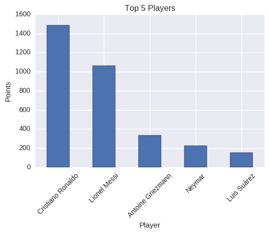
The top 5 highest scoring players in the FIFA awards
FIFA routinely release all the votes, and I wanted to explore the data further. Specifically, I thought there might be some interesting geographic patterns (e.g. all of South America voting for South American players and so on), so this was a map plot waiting to happen.
The Data
FIFA weren't going to make this easy; the dataset is a PDF with tables in it. While there appear to be a few ways to extract tables in Python, none of them worked for extracting these tables, and neither did highlighting it and trying to paste it into Excel.
Tabula to the rescue! Tabula is a great open source tool for automatically finding tables in PDFs and it worked perfectly.
To save anyone else this trouble, here's the final csv file.
Not all countries had all three vote types (captain, coach, media) and I wanted to use a single vote for each country, so I used the priority order of coach -> captain -> media. This is why for example the vote for Argentina isn't for Messi, because the coach vote was missing and Messi himself is the captain who couldn't vote for himself.
The Tools
I wanted this to be a chance to explore folium, a great Python package for making maps.
Folium supports choropleths, but you have to provide a JSON file with topological information. I used data from this gist but had to match each country to the countries in the FIFA tables, because they didn't always match and there are a few countries that weren't present in both data sources.
One modification I had to make is that it's not currently possible to add an ad hoc legend into a folium map, so I built an HTML legend and injected it myself. I knew that HTML knowledge would come in handy for data science!
The code (hopefully) speaks for itself, you can view the Jupyter notebook on GitHub.
The Map
Here's a little preview of the final map, although the HTML version is better for exploring different regions.
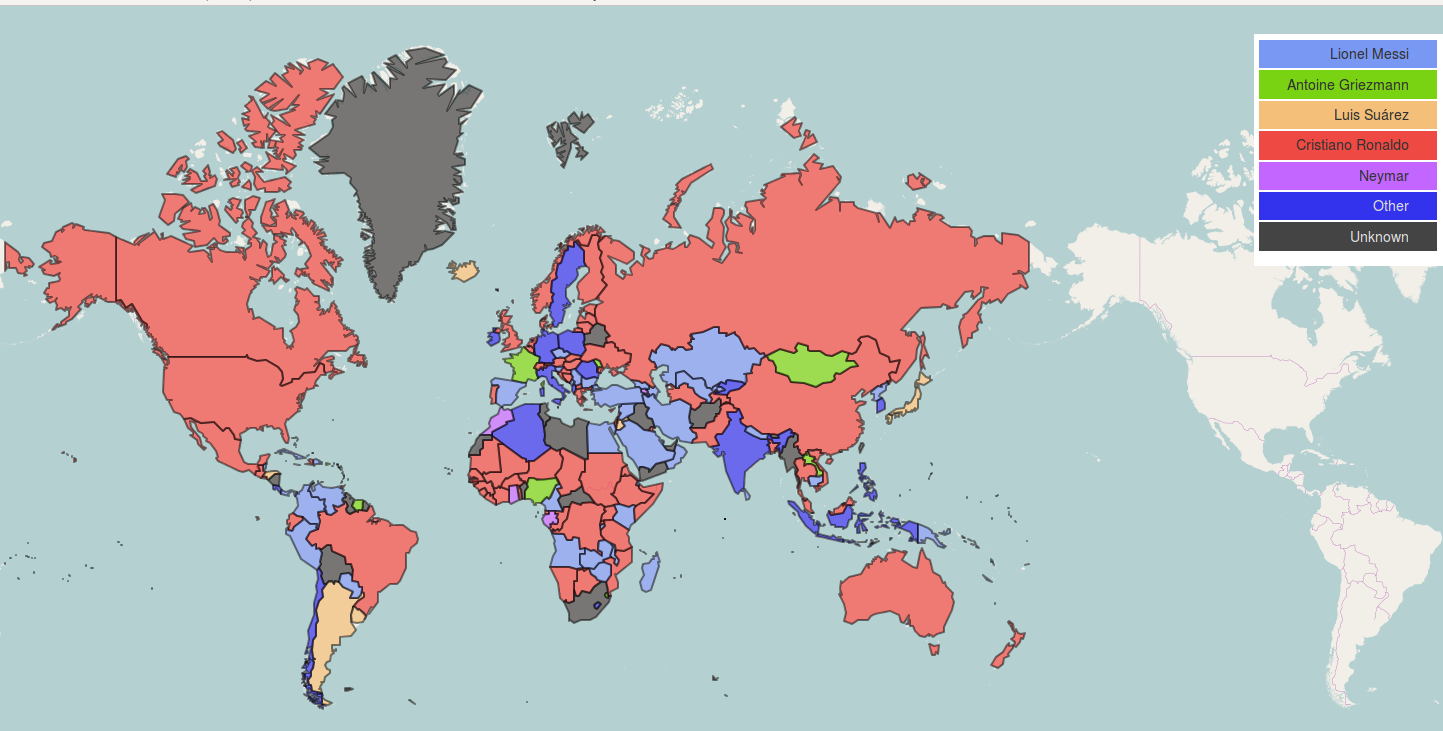
That Griezmann sure is popular in Mongolia
Wrap-up
Unsurprisingly, a lot of countries vote for their own players where they have players good enough. I'm looking at Sweden, Germany, or Poland here. I'm unsure if this is out of national pride or whether they believe their players are genuinely better than Messi or Ronaldo, probably the former. Brazil interestingly bit the bullet and voted for someone else despite having Neymar as a reasonable option.
Folium doesn't currently support hover actions, but a nice addition would be to be able to hover over a country to see who they voted for, especially for the "Other" category. It might be in a future version of folium, as it seems to be actively under development. Realistically, a tool like Tableau would be better suited to a visualisation like this, but the ability to embed maps in Jupyter notebooks makes folium a really good addition to my data science toolkit.
This post originally appeared on my blog in 2017

About David
I'm a freelance data scientist consultant and educator with an MSc. in Data Science and a background in software and web development. My previous roles have been a range of data science, software development, team management and software architecting jobs.
