Introduction
London is expensive. So much so that it's a trope now for those that live there. But what does the data show? Are things getting better or worse? How did the 2008 recession affect buying behaviour for example?
I wanted to find out. With data.
There are many directions you could go with a dataset of London house prices, so I focused on answering specific questions. I wanted to know:
- Can the recession, centred around 2008, be seen in the house price data?
- Which boroughs are on the rise economically, and which are exhibiting a downward turn?
- How have housing prices changed over time overall?
- Does the overall trend match the individual trend in each borough?
- Which boroughs are similar in their economic trends?
The Data
The dataset was obtained from an online service called Enigma, which requires a free registration to access the data. It contained the address of each house and the postcode, but not latitude-longitude values. I could have geocoded each address individually to get accurate lat-long values, but life's too short and postcodes were granular enough. I added lat-long values by joining a geocoded postcode dataset.
The final housing price dataset consisted of 16 columns and around 1,500,000 rows. The main columns of interest were:
- Date of Sale (to the nearest day)
- Postcode (now with latitudes and longitudes)
- Local Authority (i.e. borough)
- Price (in GBP)
- Property Type (Detached, Semi, Terraced, or Flat/Maisonette)
- Build (Old or New)
The data covers the period between 1996 and 2014, so this post won't turn into a digression about Brexit, although that will be an interesting dataset in a few years.
There were a few boroughs with only a handful of rows in the dataset. One of them for example was a Welsh address, incorrectly labelled as 'London'. I removed 5 boroughs in total because they were either outside of London, or contained less than 20 examples.
The Tools
The data wrangling was done in Python and all the visualisations were created with Tableau.
The Analysis
Price Distribution
The very first question I wanted to answer is what the distribution of prices is like.
The median house price is £320,000 and the upper whisker of the box plot is £1.26million. After that there are over 39,000 outliers with the highest house price at over £50 million. This suggests there may be two tiers of house prices in London: one for the 'average' person and one for the more wealthy.
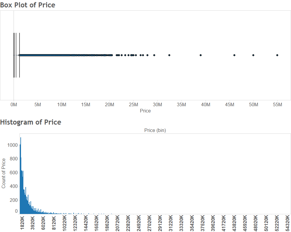
Heavy right tails make box plots look ridiculous
At this point my hunch was that the buying patterns of people who can afford to pay millions for a house will be different to people buying houses for around the median price. To this end I created an "outliers" category and analysed those nearly 40,000 rows separately.
Prices over Time
So how have prices changed over the years in the "normal" and "outlier" categories?
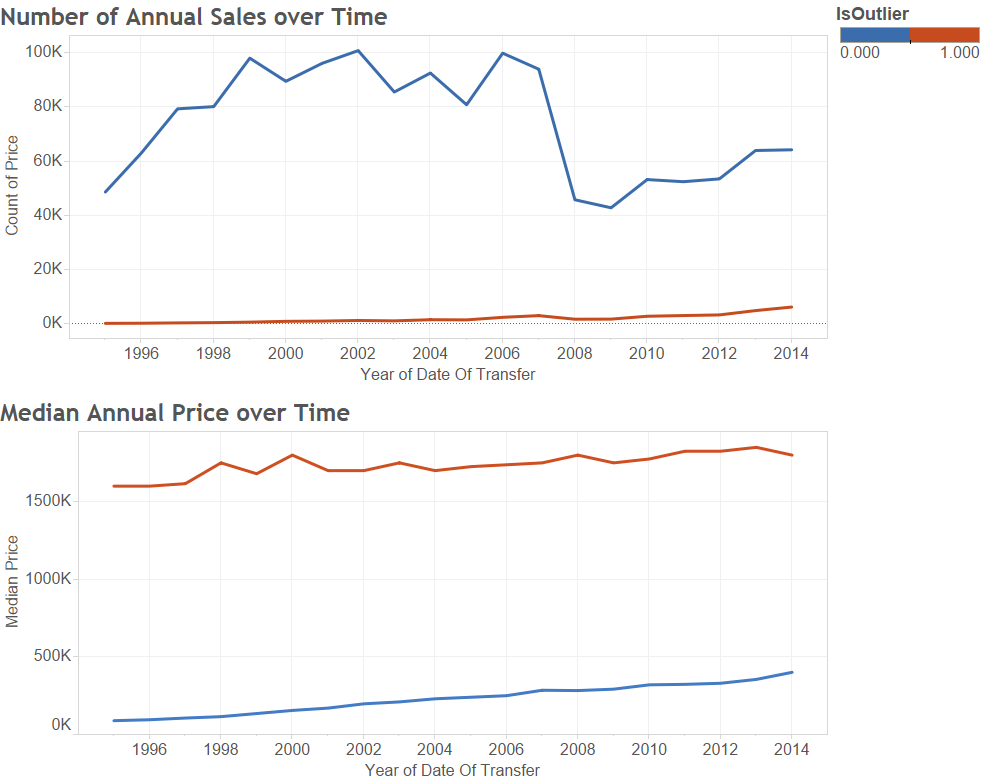
At this point it might be cheaper to invest in a time machine and go back to 1996 to buy a house
It turns out prices have steadily been climbing for both categories, but the number of sales dipped during the 2008 recession, but only for the non-outlier category. That makes sense - you'd expect the most wealthy to be unaffected by a recession.
What about each borough?
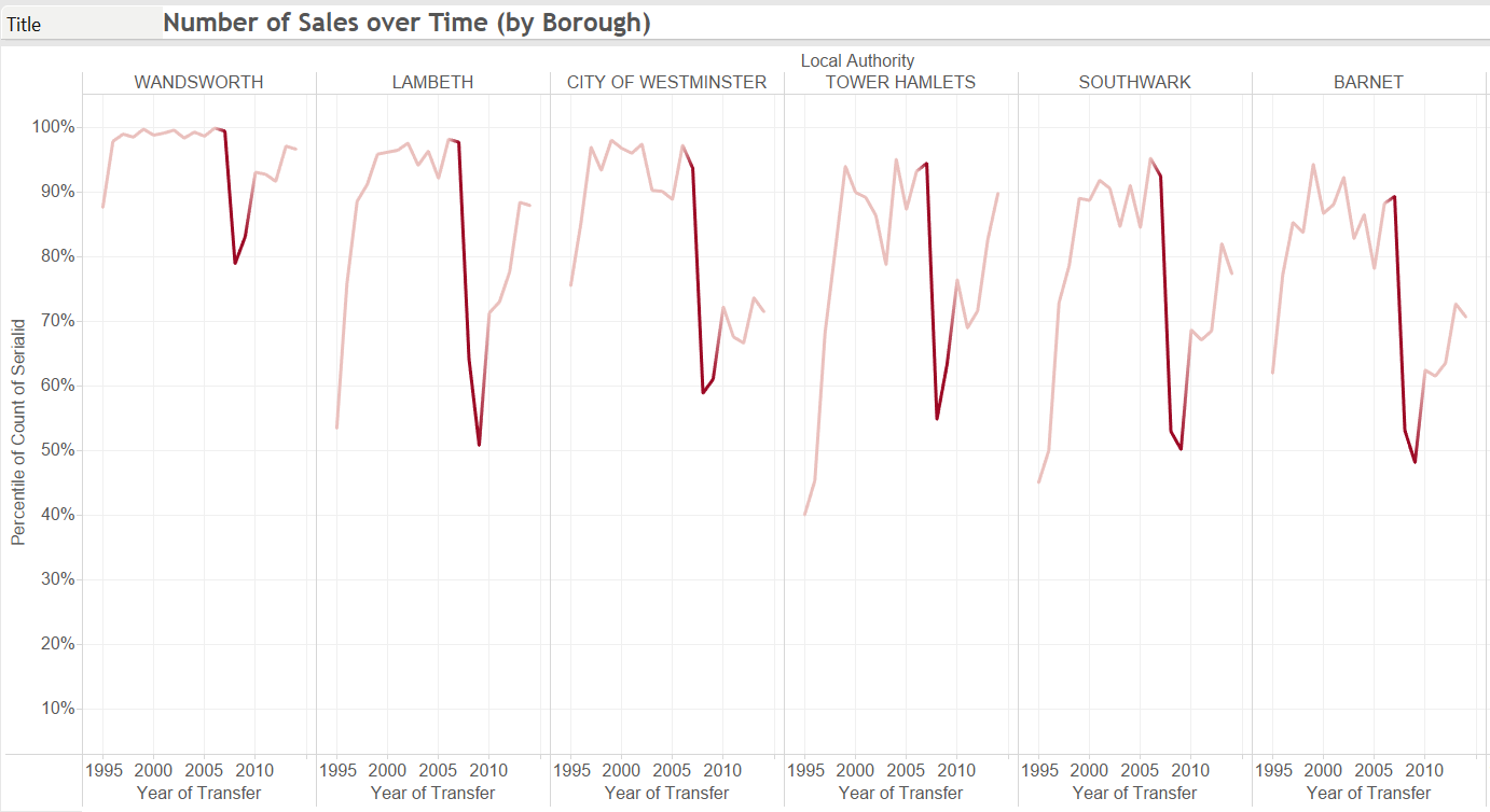
Does this overall trend look the same in each borough? Let's find out. For borough-level figures I looked at the non-outlier category to make the analysis more relatable.
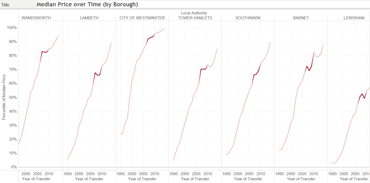
Some boroughs have a small dip but even a recession couldn't make London more affordable
There is a more noticeable, but still very small, dip during the recession years (highlighted in dark red) but prices are climbing in all London boroughs. The dip in sales during the recession is also present in each borough, echoing the overall trend.
This graph would probably be a worrying EKG
Buying Behaviour
Is buying a house seasonal or do people buy with the same frequency throughout the year?
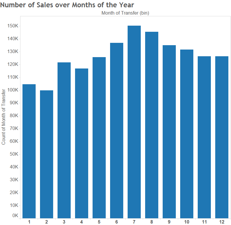
Apparently people rarely buy houses as Christmas presents.
The slight peak in March is interesting.
After I showed this to a few people, someone suggested it's because the tax year in the UK ends in April so people might end up buying with some urgency to keep the spending in the previous tax year. This general seasonal behaviour is also apparent in each borough.
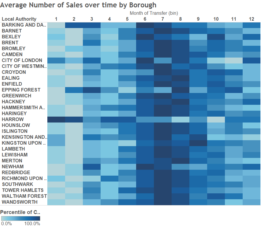
Is it still a heatmap if it's blue?
It looks like some of the boroughs have a bigger peak in March than others. Can we quantify which boroughs have this behaviour and which don't?
Clustering
How do we find similar boroughs? We can make use of clustering.
First, we aggregate each borough into a 12-dimensional vector, where each item corresponds to the median percentage of total sales in that particular month. So in a slightly extreme example, a borough with half of all its sales in January and the other half in July would look like this:
[0.5, 0, 0, 0, 0, 0, 0.5, 0, 0, 0, 0, 0]
We need to use the percentage rather than actual values to ensure all boroughs are on a common scale. Otherwise, we would end up clustering boroughs together simply on sales volume rather than buying behaviour.
After trying multiple values of k in the k-means clustering algorithm, it looked like there were two distinct clusters with three outliers. Those outliers were boroughs that had much fewer rows in the dataset, so they're arguably not that representative.
It appears then that there are really just two types of behaviour - boroughs that have a prominent peak in sales in March and those that don't. But which boroughs are which? Let's colour a map of London by cluster:
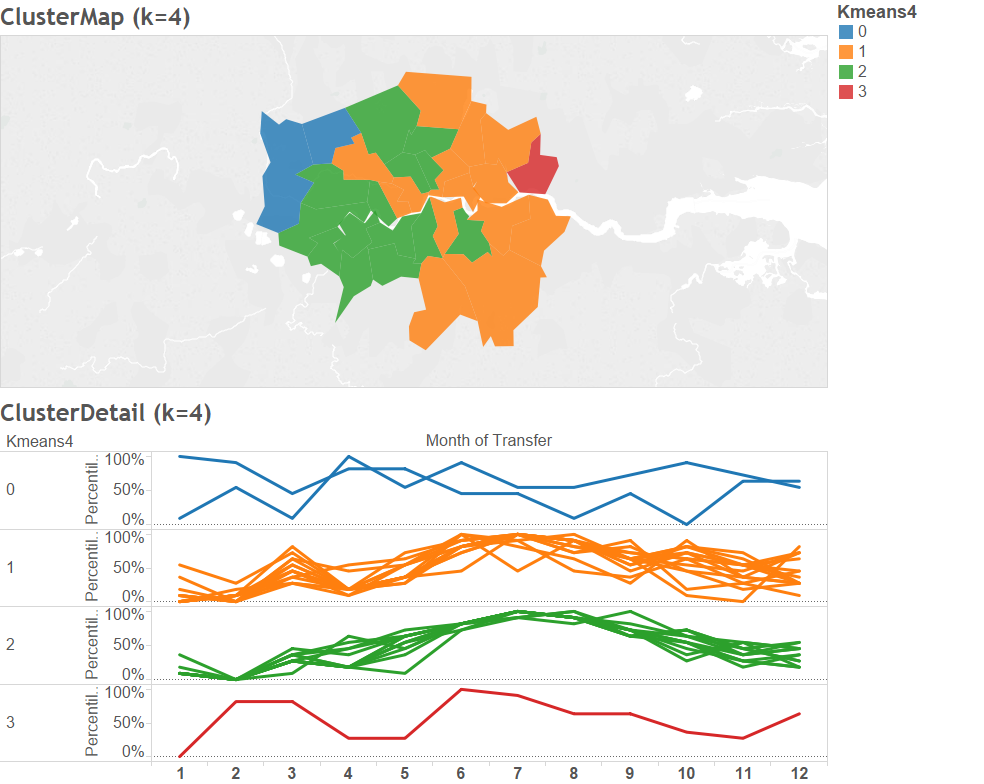
Interestingly the different seasonal behaviour almost neatly splits London into East and West. The dataset unfortunately didn't have enough details to give any suggestions about whether this is a coincidence.
Conclusion
Unsurprisingly, the data confirms what we all complain about - buying in London is expensive and it is only getting worse.
The recession impacted the average person; the number of sales dipped dramatically between 2007 and 2009. However, the rich were unaffected.
Buying behaviour is seasonal peaking in July, with some boroughs displaying a small peak in March (possibly for tax purposes). These boroughs are typically in East London, which may or may not be a coincidence.
The next analysis on my list might be finding a new, more affordable city!
This post originally appeared on my blog in 2016

About David
I'm a freelance data scientist consultant and educator with an MSc. in Data Science and a background in software and web development. My previous roles have been a range of data science, software development, team management and software architecting jobs.
